Thursday, 27 March 2014

Swing Tag No.2


This is my favorite swing tag as it has pure class and elegance. Using the soft cream colouring for the background, and the elegant and quite artistic font with the lettering it gives the tag, its own statement. It is simplistic but I believe that it makes more of an impression and stands out more than the other three that I have created. This is a tag that could be used in a vintage shop, boutique or just a more expensive high street store like. House of Fraser or Zara.

Swing Tag No.1

This is my first swing tag; I experimented with different textures to use as the background for my swing tag. I have used a basic hole for the tag to be attached to a garment, and made the statement with the font that I have used, as it is a total contrast colour to the texture used for the background, and the font has almost got a retro feel to it, as though it is similar to the writing used for American diners or for the name plates on cars. This swing tag design reminds me of the Sheila's Wheels adverts purely from the way it has been decorated. To create the hole for my swing tags to be attached clothing, I used the 'Path Finder' tool.

Thursday, 13 March 2014

My Green Themed Mood Board


My mood board, to be used for our project, showing a theme of green, with strong pictures symbolizing nature, animals and creative features. I love this mood board, as it gives me a real feeling of calmness and tranquility, with the use of the different washes of green that have been applied to each image individually. The use of nature mixed with the crayons, the stork with the moon over the water, and the image of a photograph I think work really well together as it means there is a range of different aspects that make up the actual mood board. If I could change anything I would not have put so many images or I would have made the images smaller so that they can be spread out and allow room in between, so that it doesn’t look so full and overcrowded.

Learning How To Use The Pen Tool


The pen tool is difficult to use but when you learn how to use it properly, it can be really fun. Using a grid to make sure all of the shapes were symmetrical and of the same size. Using the pen tool to create different shapes and manipulating shapes with the use of the pen tool. We also learnt how to change the colour of the shapes and how to fill them to how we want, and how that can make different effects. This is very useful as it means I can use it in all different aspects of my work when I need to and I can be much more creative with my work. Learning how to make shapes and then using them to connect different shapes together and manipulating them into the perfect shape that you need which is perfect for when you are creating illustrations, as it means if you have patterns or designs on a garments you can create them accurately, just like you want them, yet they can be so easily changed if it doesn't look right or if it hasn't come out how you've wanted it too. Another thing that is great is that you can duplicate objects so that you can make everyone exactly the same as they would simply be a clone of the original shape you have created.

Thursday, 27 February 2014

Fashion Magazine Mood Board


April 26th 2012 by Bryna

Photos: Elle France, Elle Ukraine, Flare, Grazia Germany, Harper’s Bazaar Spain, Muse, The Block


This moodboard, is confusing with the mixed messages that are created because there is such a vast mixture of colours and themes, there is also not enough elements involved in the moodboard to see clearly what the main theme of the board is and to make it strong. The images they have used are very effective there just isn’t enough of them.

Green Mood Board


creatively-driven.com


This is an excellent mood board because it gives you a defined message that the mood is different shades of green and forms of nature. There is a good mixture of clothing, models, block colour and textured patterns, also photographs of elements of nature. It is a strong board because everything is clear. The theme of the board is very well shown to us and there is a mixture of elements making up the board.

The only thing I would change about this board would be having the elements more spread out.


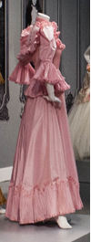
Flounced dress

Bath Fashion Museum


This is a picture I took of a flounced dress that is in an exhibition in the Bath Fashion Museum.  
I used the Kaleidoscope, effect on my mobile. The reason i put this image on my blog is because I think it is a really effective image because of how the app on my phone has changed the dress and created a pattern that would look very effective as a design on a dress or a textile sample.


This is the original dress.