Digital embroidery is used in the industry for stitching names, company logos and embroidery patterns on garments. Designs can be put into a computer, which are then transferred to industrial sewing machines that will sew the design on to the chosen garment within minutes, even seconds without having to have any help from a member of staff, the only thing they have to do is put the garment into the machine and take it out.
Wednesday, 18 June 2014
Digital Embroidery
Digital embroidery is used in the industry for stitching names, company logos and embroidery patterns on garments. Designs can be put into a computer, which are then transferred to industrial sewing machines that will sew the design on to the chosen garment within minutes, even seconds without having to have any help from a member of staff, the only thing they have to do is put the garment into the machine and take it out.
Quality
Quality of images is all about the size and percentages of the image.
When using Photoshop and Illustrator.
Photoshop works using pixels and light to create an image where as illustrator uses vectors. Photoshop allows you to be free with the art work that you create as you have a lot of freedom where as because illustrator uses vectors it restricts you as to how much you can do, however if photoshop images are enlarged they can lose their quality. too the point that the image is hardly recognisable like this;
Illustrator isn't for creative art work, but it is excellent for professionals such as architects, for when they are creating building designs, because the use of vectors allows the to be able to enlarge images so that they can focus on one area of an image without it being blurred. It allows them to work at a much larger scale and in far more detail.
When you are using computer programs like Photoshop you need to be careful and have a full understanding of what you need from an image such as the quality of the image you need for what you are doing with it. For instance is you are printing an image the quality of the image should be set to 300 DPI (dots per inch). That allows 300 dots of light per inch in the image that are in a straight line. However if you are using an image for the web then you need the quality of the image to be set to 72 DPI (dots per inch). This is because you don't want the image to be too large as it will take up too much memory as it would be a large file, and it also allows the image to load quickly, as the larger the image the longer it takes to load.
resolution, however when an image in on the web is should on be 72% resolution.
It is also all about colour, for example you have
RGB which is on the screen it is used in photoshop, as the colours mixed together create light (white), which are the colours RED, GREEN and BLUE
CMYK, these are the colours used when printing, they are the colours, CYAN, MAGENTA, YELLOW, BLACK. Together they make black.
Thursday, 12 June 2014
Fashion Realisation
These were created on illustrator. I created the basic dress using a template and I then added sleeves to play around with how the dress could look. I then played around with altering the size of the illustration that I had created on illustrator, using different sized brushes.
To create the dress: Dress design, select the chosen lines, press O, click on guide
Hold Alt, click on the centre line, swing out the design to the centre line, press shift to position it as an exact mirroring to the original half of the dress, let go of everything TOGETHER.
White arrow, select end nodes, hold CMD J to join all of the lines together as one piece.
Group together, hold CMD C, CMD V
Click dress, press S, press ENTER, this allows you to change to scale of the image you want to be imported onto your dress design.
This is what I created on illustrator using the brush tool, using different sizes and opacity to get the shape of her face an her features. I decided to look at creating a face as it is one of my weak points as I can never get it into proportion. However I am very happy with this and I like the effect i get from using the red as a back ground.
Hardware
CAD - Computer aided design.
this is used to create designs on computers allowing the production of clothes to be far more accurate and economical. it allows designs to be changed or modified within seconds. You can use it to produce a design for one season of clothing and if it was a best seller, then the design could be altered for the next season within seconds.
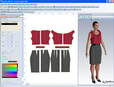
CAM - Computer aided manufacture.
This can be used from basic patterns, that can be exchanged from paper onto the computer, so that everything is precise to the milimetre.

Laser Cutting -
technology used for cutting materials such a wood, fabric, acrylic and many others. It is used by concentrated lasers that can be used to cut out shapes of patterns in materials or engrave into materials. I cannot be used to cut metal or hard materials, it can only be used for enscribing.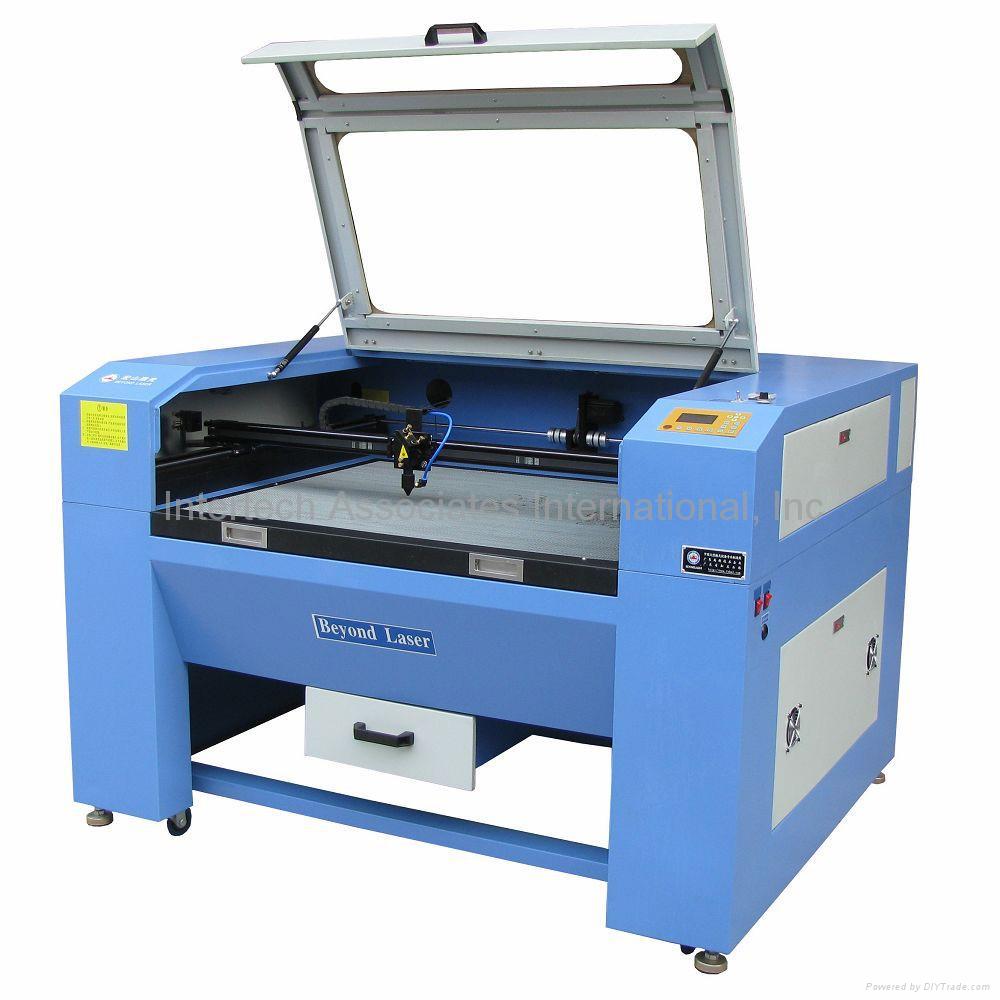
this is used to create designs on computers allowing the production of clothes to be far more accurate and economical. it allows designs to be changed or modified within seconds. You can use it to produce a design for one season of clothing and if it was a best seller, then the design could be altered for the next season within seconds.

CAM - Computer aided manufacture.
This can be used from basic patterns, that can be exchanged from paper onto the computer, so that everything is precise to the milimetre.

Laser Cutting -
technology used for cutting materials such a wood, fabric, acrylic and many others. It is used by concentrated lasers that can be used to cut out shapes of patterns in materials or engrave into materials. I cannot be used to cut metal or hard materials, it can only be used for enscribing.

Tuesday, 10 June 2014
Fashion Graduate Week

This is the winner of the Gold Award at Graduate Fashion Week 2014. Bath Spa University's Grace Weller.
On Monday 2nd June we took a trip up to London to visit Fashion Graduate Week, where we got to see all of the available fashion universities and cat walks of clothing that this year university graduates had created.
photoshopped free machineing
I created this image by scanning in some free machine embroidery that I had created and using Photoshop to manipulate and create a new version. Using un-life like colours, bright and bold colours for the garments and not giving the models facial features. When using photoshop it is all about layers, that have lists, pixels and bitmaps that make up the images that you create.
Monday, 9 June 2014
This is a free machining sample that I created using an embroidery machine to use as one of my final three images in my project. I created the patterns and textures by using different stitches, and playing around with the width of the stitches. I decided to use the bright colours to make a statement against the black fabric, because it speaks for itself.
Cartoonisation
I used Photoshop to create a cartoon version of this puppy, to look at how images can be changed. I used the basic brush tool, but I played around with the opacity and tones of colour, so see what effects I could create just by using colours. I decided to use this image as I was reasonably simple, as I am not that confident with how adventurous to be using Photoshop. I based the cartoon version from what I have seen on children's programmes, advertisement and the media. Overall I think the outcome was creative and workable, but I could still play around with some other elements to see what effect that would have on the image.
Thursday, 15 May 2014
Photoshopping Image. http://opiniondemymy.blogspot.co.uk/2011/08/photoshop-jessica-alba-avantapres.html
Photo shopping image.
This was a shoot that was done with Jessica Alba. The left hand image is the original and the image on the right is the one that has been photo shopped. The original has been airbrushed, had colour changes and they have slimmed down her figure and taken the creases out from her groin area. The other thing I have noticed is that in the original she is looking to the right, but in the photo shopped version she is starring directly into the camera. They have also defined her breasts and cleavage. They have defined all of her bones, including her collar, neck and shoulder. They have taken away the muscle on her right leg, to give her a slimmer, sleeker, more defined figure.
Through out the whole fashion industry, all of the images we find in magazines, blogs, newspapers and throughout the Internet. All young girls are now seeing fashion models and celebrities as tall, slim, perfect skin, long, shiny, sleek hair. It is showing young girls, that we should all look the same, and that we need to wear lots of make up, and wear skin tight clothes, and have to be a size 8/10. That it is also not the done ting to be a curvatious girl. I personally think it is wrong as I believe we are all our own person. NO ONE IS PERFECT!
Playing around in Photoshop
I created this on Photoshop using the brush
tool. I used different effects including water colour, ink, and normal paint. I
created this by using an image. and using the effects to re-create this image.
This image is on my blog under the name, 'Water Colour, Fashion Illustration'.
Marguerite Sauvage, Animated Fashion Illustration
Marguerite Sauvage
The use of animals
and fashion together, with the use of different generations. The way she has
created this image through animation I love, as it is far from the conventional
way of illustrating clothing. I also like the use of different generations that
she has used as it shows variation. The use of vibrant colours also works very
well because they are what I would associate with 'safari' colours, which inter
winds with the animal heads.
Thursday, 8 May 2014
Water Colour, Fashion Illustration
I love this way of illustrating fashion,
because it isn’t just the normal way, of a template figure, with the outfit
illustrated on to it, it is making the figure, outfit and all of the other
components together in one image. I also love the use of the water colours as
it gives it a feeling of freedom, originality and tranquillity. This is because
the colours flow into one another creating curved lines and organic shapes with
a balance between the colours.
The red, purples, oranges and browns mixing together and flowing down into greys and blacks. The yellows, blues and blacks all mixing together. The colours are all complimentary of each other.
This fashion illustration was created by Amelie Hegardt.
The red, purples, oranges and browns mixing together and flowing down into greys and blacks. The yellows, blues and blacks all mixing together. The colours are all complimentary of each other.
This fashion illustration was created by Amelie Hegardt.
Thursday, 3 April 2014
Using Illustrator
Illustrator is all about vectors, as that is how the images on the screen are made up.
I created this using the
pen tool on illustrator, and I really enjoy using this tool once I got the hang
of what I was doing, and it will become very useful when creating technical
drawings and other thing for different aspects of the fashion course, the use
of being able to create two simple shapes and then being able to take away
different sections of the shape to create completely different shapes, to be
able to design and create what you want. I can use the pen tool in all
different ways now that I know how to use it and what different things I can do
and create with it.
Swing Tag No.4
This swing tag has the elements of being very busy and yet
simple at the same time with the use of the font of the text and the use of
just a single placement of the name, in a big font. I personally like the
background as it has an element of nature with the peacock’s feathers. But it
is also fun and quirky. I could see this tag being used in many high street
shops, or independent shops, I couldn’t see it being used in high end shops
such as Chanel or Dior though, as it doesn’t have that slight edge of class and
elegance.
Swing Tag No.3
This swing tag is my least favourite as
there is way to much going on with the design. The use of a background, and
then shapes on top of the background, which has then had the name placed on top
of that, many times, which does in fact make a statement, but it is too busy, I
like things to be plain and simple. Less is always more. I could see this tag
being used in a vintage shop or weird and wonderful boutique, that sell all
kinds of crazy clothing, for the people that have their own fashion statements.
Thursday, 27 March 2014
Swing Tag No.2
This is my favorite
swing tag as it has pure class and elegance. Using the soft cream colouring for
the background, and the elegant and quite artistic font with the lettering it
gives the tag, its own statement. It is simplistic but I believe that it makes
more of an impression and stands out more than the other three that I have
created. This is a tag that could be used in a vintage shop, boutique or just a
more expensive high street store like. House of Fraser or Zara.
Swing Tag No.1
This is my first
swing tag; I experimented with different textures to use as the background for
my swing tag. I have used a basic hole for the tag to be attached to a garment,
and made the statement with the font that I have used, as it is a total
contrast colour to the texture used for the background, and the font has almost
got a retro feel to it, as though it is similar to the writing used for
American diners or for the name plates on cars. This swing tag design reminds
me of the Sheila's Wheels adverts purely from the way it has been decorated. To
create the hole for my swing tags to be attached clothing, I used the 'Path
Finder' tool.
Thursday, 13 March 2014
My Green Themed Mood Board
My mood board, to be
used for our project, showing a theme of green, with strong pictures symbolizing
nature, animals and creative features. I love this mood board, as it gives me a
real feeling of calmness and tranquility, with the use of the different washes
of green that have been applied to each image individually. The use of nature
mixed with the crayons, the stork with the moon over the water, and the image
of a photograph I think work really well together as it means there is a range
of different aspects that make up the actual mood board. If I could change
anything I would not have put so many images or I would have made the images
smaller so that they can be spread out and allow room in between, so that it doesn’t
look so full and overcrowded.
Learning How To Use The Pen Tool
The pen tool is
difficult to use but when you learn how to use it properly, it can be really
fun. Using a grid to make sure all of the shapes were symmetrical and of the
same size. Using the pen tool to create different shapes and manipulating
shapes with the use of the pen tool. We also learnt how to change the colour of
the shapes and how to fill them to how we want, and how that can make different
effects. This is very useful as it means I can use it in all different aspects
of my work when I need to and I can be much more creative with my work.
Learning how to make shapes and then using them to connect different shapes together
and manipulating them into the perfect shape that you need which is perfect for
when you are creating illustrations, as it means if you have patterns or
designs on a garments you can create them accurately, just like you want them,
yet they can be so easily changed if it doesn't look right or if it hasn't come
out how you've wanted it too. Another thing that is great is that you can
duplicate objects so that you can make everyone exactly the same as they would
simply be a clone of the original shape you have created.
Thursday, 27 February 2014
Fashion Magazine Mood Board
April 26th 2012 by Bryna
Photos: Elle France,
Elle Ukraine, Flare, Grazia Germany, Harper’s Bazaar Spain, Muse, The Block
This moodboard, is confusing with the mixed
messages that are created because there is such a vast mixture of colours and themes, there is also not enough
elements involved in the moodboard to see clearly what the main theme of the board is and to make it strong. The
images they have used are very effective there just isn’t enough of them.
Green Mood Board
 |
| creatively-driven.com |
This is an excellent mood board because it gives you a defined message that the mood is different shades of green and forms of nature. There is a good mixture of clothing, models, block colour and textured patterns, also photographs of elements of nature. It is a strong board because everything is clear. The theme of the board is very well shown to us and there is a mixture of elements making up the board.
The only thing I would change about this board would be having the elements more spread out.
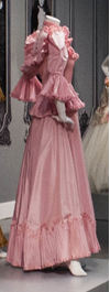
Flounced dress
Bath Fashion Museum
This is a picture I took of a flounced dress that is in an exhibition in the Bath Fashion Museum.
I used the Kaleidoscope, effect on my mobile. The reason i put this image on my blog is because I think it is a really effective image because of how the app on my phone has changed the dress and created a pattern that would look very effective as a design on a dress or a textile sample.
This is the original dress.
Subscribe to:
Comments (Atom)


